CSS毛玻璃效果 取自Apple官網
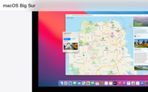
效果取自apple官網的選單區域純靠CSS達成毛玻璃效果 -webkit-backdrop-filter: saturate(180%) blur(20px); backdrop-filter: saturate(180%) blur(20px); backg ...
CSS多行文字出現…的省略號
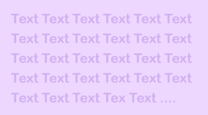
常用於標題、預覽內文時會先看到局部的文章可用CSS去隱藏超出父層寬度,並顯示…省略號多行跟單行只要調整-webkit-line-clamp的值就可以 overflow: hidden; display: -webkit-box; -webkit-line-cl ...
CSS網格佈局 RWD運用 display: grid
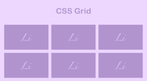
Rwd佈局中常會出現網頁版是顯示較多行一列,手機版則顯示較少行的畫面需求。此時就會運用到display: grid這個屬性 以下範例為螢幕大於767px時3行一列,小於時顯示2行一列 html <ul class="boxList"> <li>第一 ...